Paul-Tech’s nutrient charts show how soil nutrient levels change over time and how they respond to weather and field work, especially fertiliser applications. The charts don’t just show a single moment—they explain the process: when nutrients start moving, when they stay put, and when they are actually available to the crop.
The timeline helps you see how a single event, like fertilising or rainfall, fits into the bigger picture. Some applications give a quick response; others take weeks to show an effect.
Fertilising based on assumptions vs reality
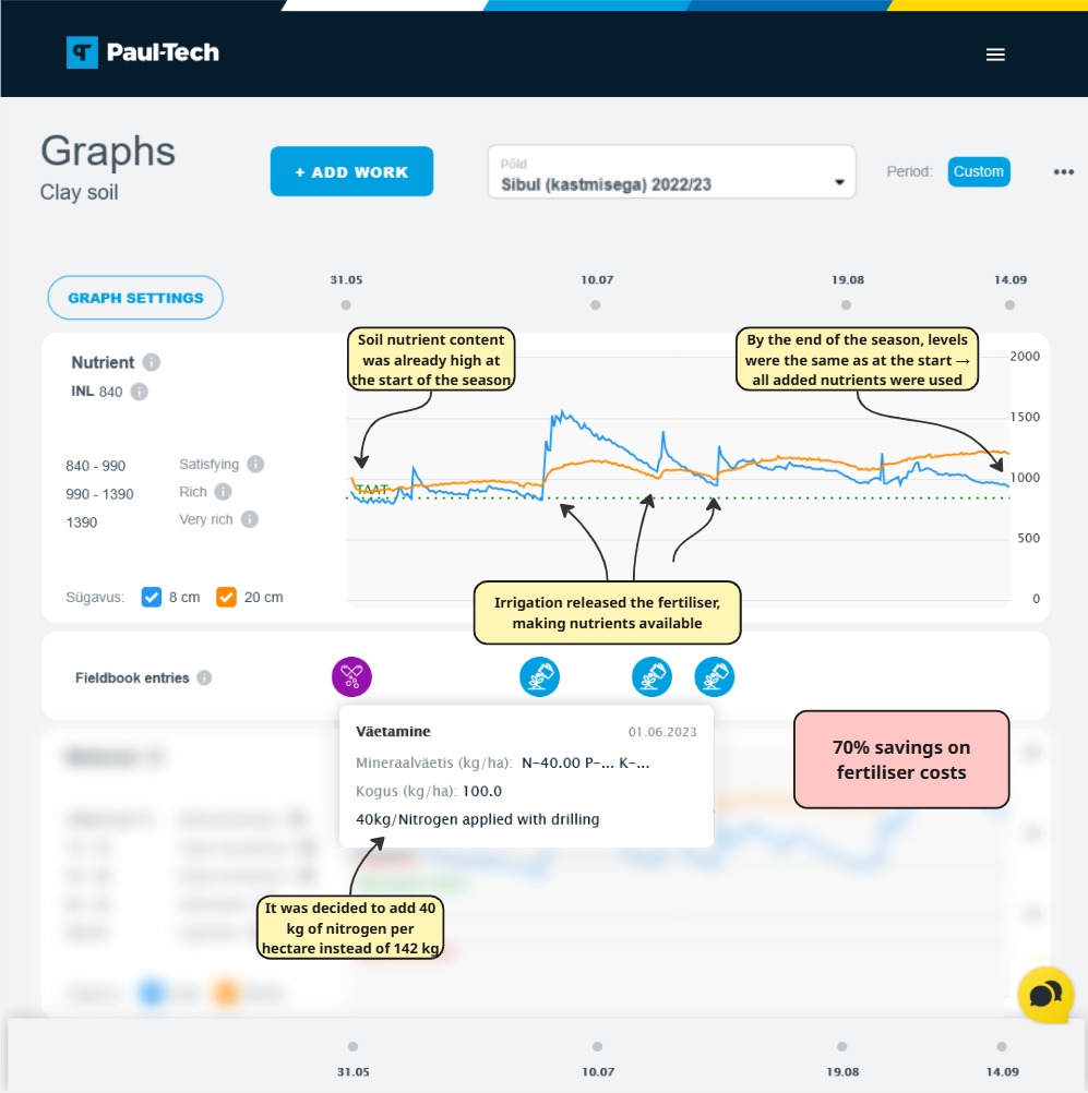
On many farms, a new crop triggers a new round of fertilising. It’s often assumed that previous nutrients are all used up. In reality, there may still be a significant amount of nutrients in the soil, just waiting for the right conditions.
Paul-Tech charts show when a new application truly benefits the crop—and when adding more fertiliser is just habit, not a real need.
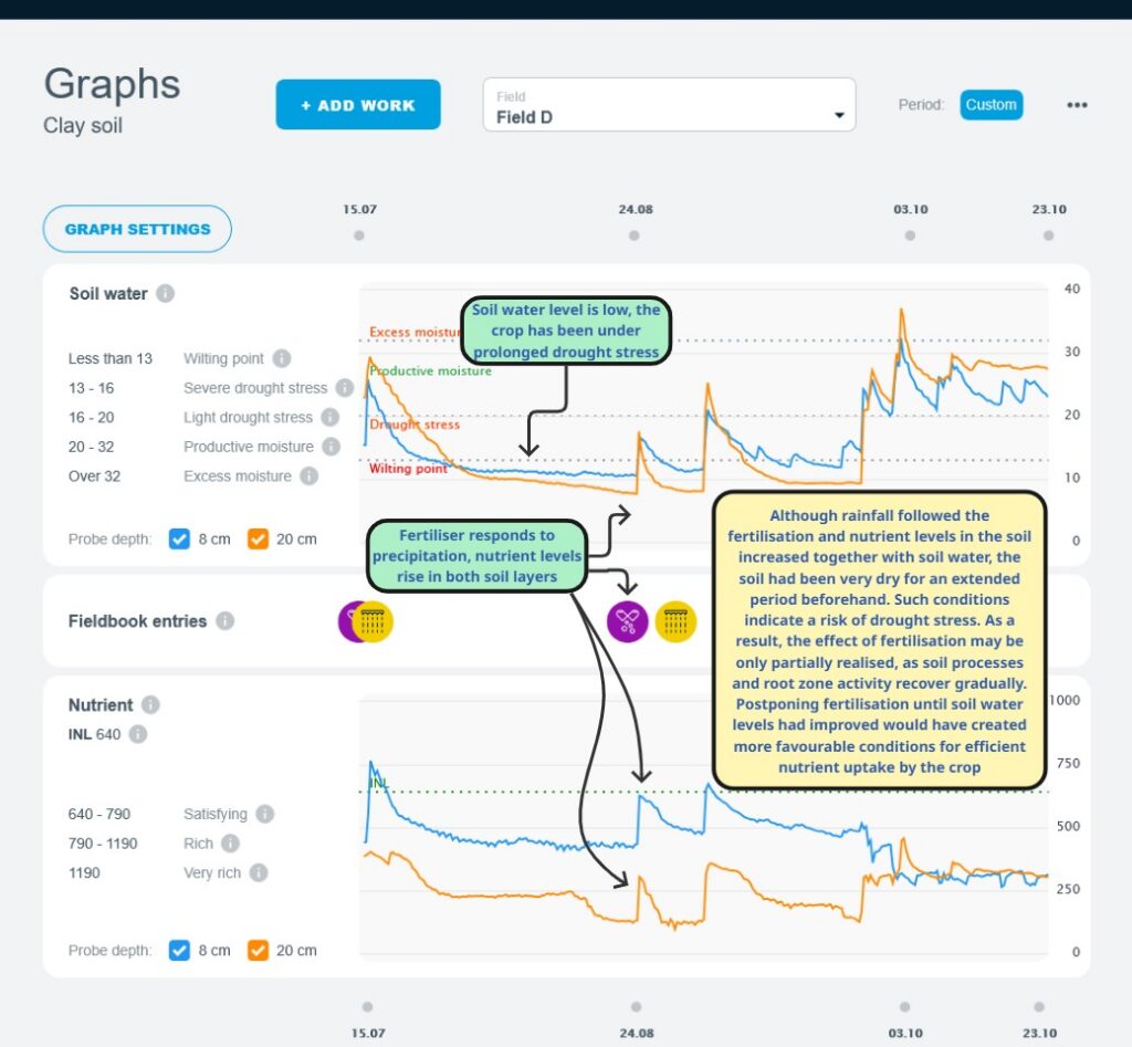
Nutrients don’t always reach the crop immediately
The charts may show nutrients present and moving in the soil, but that doesn’t mean the crop can use them straight away. Dry soil or stressed crops can delay fertiliser effects, as roots recover gradually.
The charts help you see when soil nutrient levels are truly available and when it’s worth timing fertiliser differently.
Nutrients at different depths
Nutrients don’t behave the same at all soil levels. Topsoil reacts faster to fertiliser and rainfall. Deeper layers respond more slowly. The charts let you track whether nutrients stay near the surface or move deeper.
In very wet soil, nutrient levels may rise in the top layer, then drop as they move down, and later fall in the deeper layer too. This shows nutrient movement with water, which can sometimes reduce efficiency.

Knowing when not to fertilise
The charts don’t tell you to act immediately. Often they show times when fertilising is unlikely to work—like when the soil already has enough nutrients, or the crop can’t yet take them up.
By waiting according to what the charts show, you can:
- Using less fertiliser
- Lower input costs
- Better yields and healthier crops
Viewing patterns over time
You can look at the charts over short or long periods. A short view shows the impact of a single fertiliser or rainfall event. A longer view shows ongoing trends.
Looking back, you can see when fertilising worked and when it didn’t—based on actual data, not assumptions.

Summary
Paul-Tech nutrient charts don’t tell you exactly how much fertiliser to use. They show whether fertilising is likely to be worthwhile and when it will have the greatest effect. The charts complement your knowledge, helping you make calmer, smarter decisions at lower cost.