Paul-Tech’s soil moisture charts show how the amount of water in the soil changes over time and how it responds to rainfall, dry spells and temperature. The map shows current conditions at a glance, but the charts explain the process: when changes started, how fast they progressed, and whether they reached the roots.
The timeline helps distinguish short-term fluctuations from longer-term trends. This matters because not every change affects the crop in the same way: one rain event may wet only the surface layer, while another can alter the water status of the entire soil profile.
Water movement through the soil profile
Soil water does not behave uniformly across depths. The top layers respond quickly; deeper layers show a delayed response—or may not respond at all.
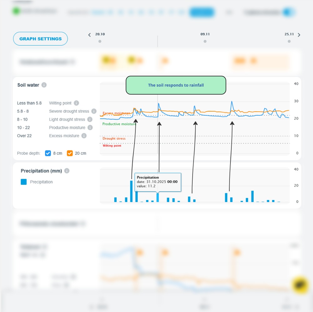
From the chart, you can see whether rainfall reached the root zone or remained superficial. With smaller showers, soil moisture may rise briefly in the upper layer and then drop back rapidly. With more substantial rainfall, moisture moves deeper and the effect persists for longer.
This difference determines whether the crop actually benefits from the water.
5-day forecast: how soil moisture may change
Paul-Tech charts include a forecast of up to five days, showing how expected weather conditions may influence soil moisture levels.

The forecast is not an instruction to act—it is an early indication. For example, it may show that tomorrow’s rain will increase moisture only in the surface layer and will not affect deeper layers. Or a long wet period could cause waterlogging.
This allows you to weigh decisions before the change becomes visible in the field.
When fertiliser does not deliver the expected response
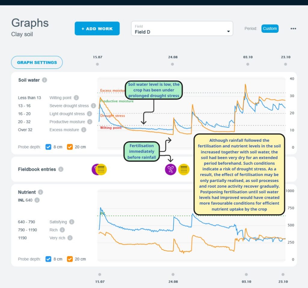
Fertiliser performance depends on soil conditions at the time of application and in the following days.

If there is insufficient soil moisture, nutrients may not move into the root zone. If the crop has suffered from prolonged drought, even the first rain may not restore performance right away. Root activity recovers slowly, so part of the fertiliser’s effect may be delayed.
The opposite situation—excess moisture—increases the risk that nutrients move with water into deeper layers or are lost through leaching.
The charts help show when fertiliser supports growth and when its effectiveness may be limited.
Stress is not always visible to the eye
Crop stress does not necessarily appear immediately as discolouration or a clear growth check. Often, visible symptoms are preceded by a longer period in which soil moisture has been unfavourable for the crop.
If the chart shows a steady drop and the daily mean temperature stays above 20°C, the crop is at higher risk of drought stress. In such conditions, even an operation that looks well-timed on the calendar—such as fertiliser application—may be agronomically poorly matched to crop uptake.
Seasonal view: soil conditions across the year
Soil moisture charts provide a complete view of the season—from autumn through spring and into summer.

In one year, the crop may enter winter with frozen, stable soil and overwinter well. In another year, winter may be dominated by above-zero temperatures, leaving soils excessively wet, and a sudden freeze can increase the risk of winterkill.
Same field, different year—and entirely different soil conditions.
Summary
Paul-Tech’s soil moisture charts do not provide ready-made answers.
They make the relationships visible—between weather, soil and the crop.
That insight supports calmer, more accurate decisions with lower risk.